Intense Black or Archival Black ?

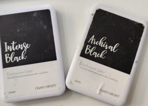
You would think Intense and Archival black ink were the same thing when you look at the packages. they both say permanant, solvent based ink and acid free. Both are waterproof, but the main difference is the Intense Black is fast drying which essentially means you can start coloring just after you stamp it. If you were to use the Archival Black, you would want to wait until it dries.

Close to my Heart states their recommendations as:

Intense Black: Recommended for use with watercolors or alcohol markers.

Archival Black: Recommended for scrapbook pages and stamping on vellum.

The Black Close to my Heart Ink is waterbased, and only recommended when you are NOT using anything with it.


If you have any questions, please leave them below in the comment section.

Creatively,

Carol


A Simple Card Sketch for a Quick and Easy Card

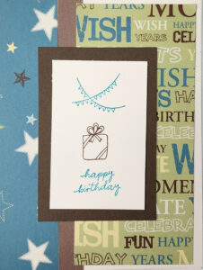
Simple Card SketchIt’s Monday, since my focus has been on scrapbook pages, I thought today was a good day to do a card sketch.Happy Birthday, Make a wish! If you missed sending out a card for Mother’s Day, you can knock this out pretty quickly and stick it in the mail today! My example is themed Happy Birthay because my son will be 41 at the end of the week…

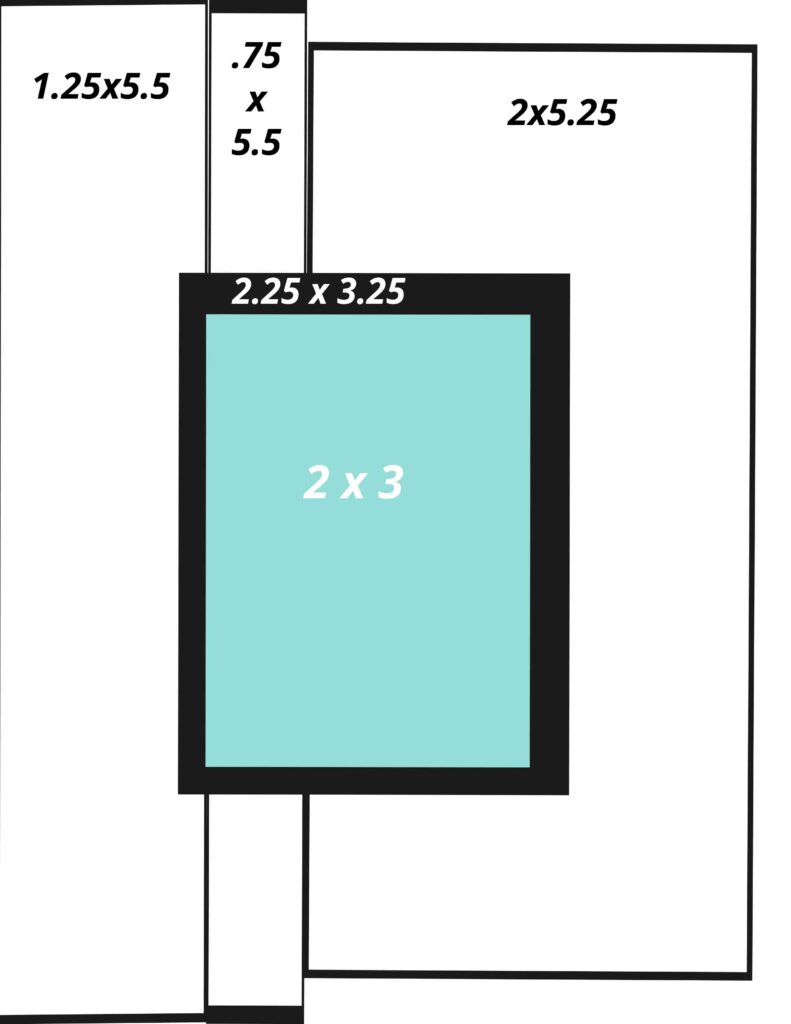
The card base is not outlined in this sketch, so I wanted to point out that the first two strips going from the left cover the card base completely, the third is a little shorter and is set just a bit below the base of the card. As I look at the finished card, I think edge distressing the card would have added a bit more dimension, and would point out the edge better.  See, I make errors in judgement too, often seein what I “should have done.” But you have to remember, there are no “shoulds” in papercrafting, unless you are following scoring lines to put something together. In this case, you could alter any part of this card and it would still be fine.

Here is my finished card. Please leave a comment below and tell me your thoughts on this card sketch and card.


Creatively, Carol


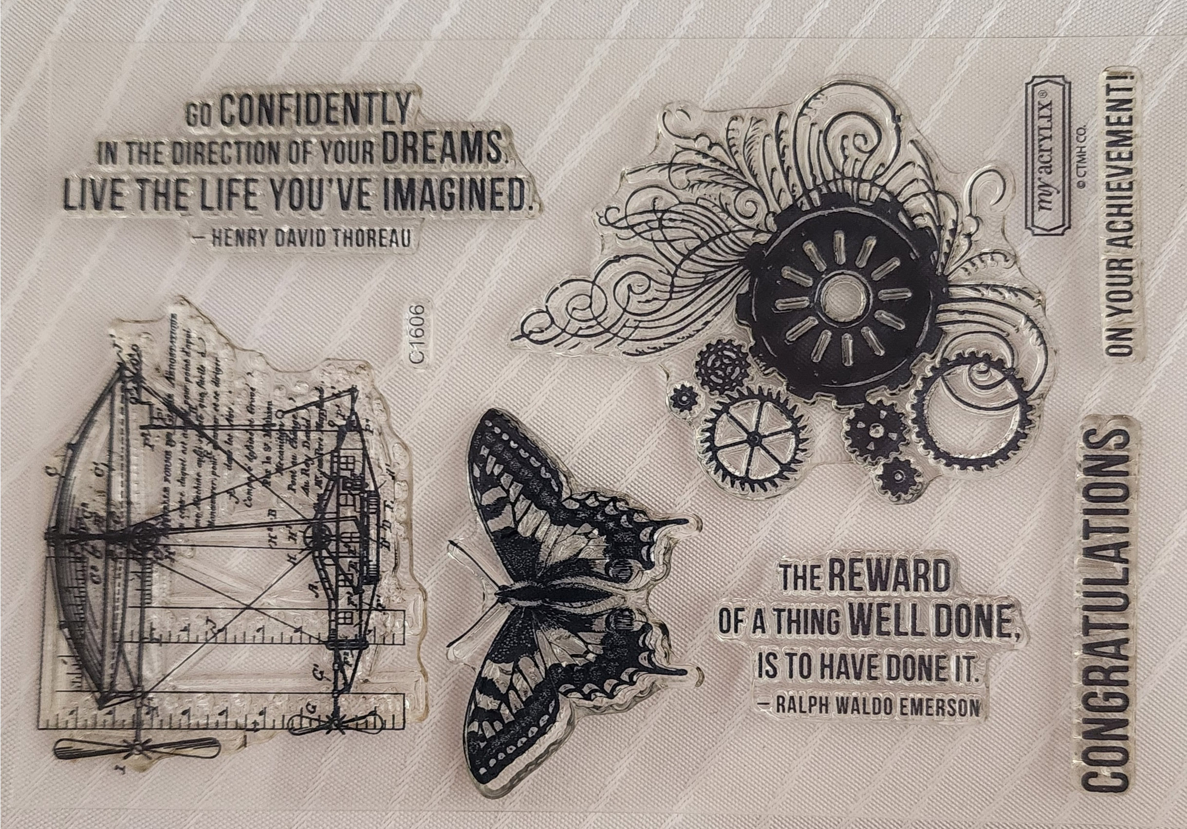
How to Care for your Acrylic Stamps

I get this question alot, especially from new stampers so I wanted to share with you what Close to my Heart’s answer to this question is…

  • Although our stamps are very durable, care must be taken when removing them from the carrier sheet, especially for the first time. To avoid tearing your stamps, gently loosen the edges of each stamp before peeling them off the carrier sheet or your block.
  • Before using your stamps, condition them so ink will transfer evenly. To do so, rub the stamp a stamp pad, and then stamp onto scra paper, twisting while you stamp. Repeat until the inktransfers evenly across the entire surface of the stamp.
  • Each stamp comes with a foam insert. This insert not only helps to protect your stamps but can also be used as a tool while stamping. By placing it under the paper you are stamping on, you will achieve a cleaner, crisper image.
  • Clean your stamps immediately after use and let them air dry. Store stamps on the carrier sheets that come with the envelope (rather than on the block) and keep them out of direct sunlight. Discoloration from inks is normal and does not affect stamp performance. I use the Stamp Shammy for most inks, but for Intense Black or Archival Black, I use the staz-on stamp cleaner.
  • Close to my Heart guarentees its stamps and products to be free from manufacturing defects for a period of 90 days from the date of purchase, and will repair or replace any defective products within that period free of charge. Please inspect your stamps and products immediately upon receipt.

If you have any questions regarding your stamps, or taking care of them, please e-mail me  or leave a comment below.

Creatively, Carol


Same Subject, Different Years, A Two Page Scrapbook Sketch

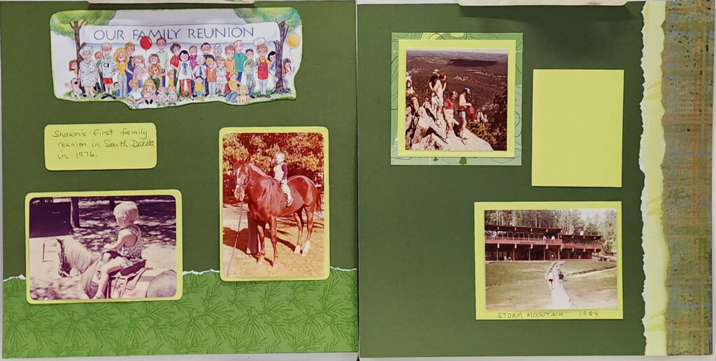
How do you scrap the same subject, but different years?  I have 4 pictures, 2 are one year, and the other two could be the same year, but I have no way of knowing. Since I tend to use more two page layouts than single ones, I decide to just do one two-page layout since I didn’t want to only have one photo on the page. After all, these are from when normal printing was 3 ½ x 5. That leaves waaay to much empty space in my mind. I put the two I knew the year, and the similarity of the child on the horse, the other two were relagated to the right side, where, if my aunt found other reunion pictures, she could add them to this page pretty easily. The journal box was attached with removable adhesive so if she did need the space, she could remove it.

The title I took from an old piece of 8½ x 11 scrapbook paper. I knew I wouldn’t use it, as I stick to 12 x 12 pages, but I thought it was perfect for the page. I used the same color to ink around the title as the background paper color to give it a softer look.  I also used the tearing technique to give a little demension to the page. I am still thinking about putting a large green tree on the right page, over the torn pieces.

If you have any questions, feel free to shoot me a text at 801-800-0884. Send me a copy of your completed layout and I will put your name in the drawing for a free stamp set at the end of the month.

Did this sketch help in scraping the same subject but different years question for you? Leave a comment below and let me know!

Creatively, Carol

Color My World…

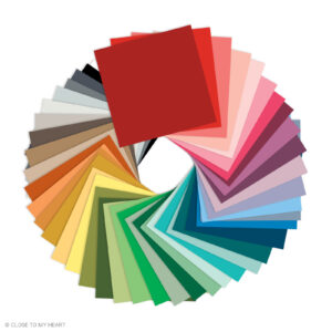
Close to my Heart Color PalOur color preferences are often motivated by the memories we have and the reactions to the mood that color brings. My favorite color is blue. Blue brings me peace, whether it is blue sky or  blue ocean, sometimes I wonder if it is because I have blue eyes and for years I thought my eyes were my best feature.

Color is everywhere and can be very inexpensive or even free to bring into your living spaces. By having more color in your living spaces and in your clothing, it is easier to pick out the colors you want to use in your scrapbook. We often choose a color in a photograph to bring out in the form of mats or background papers. Here are 6 reasons you may be avoiding more color in  your life.

  1. I’m afraid of …Seriously, what’s the worst thing that can happen? Color can’t kill you . Stop living with boring beige and white, and as the saying goes… “put on your big girl panties” Be bold, color makes you feel good.  My daughter use to say I dressed like an old lady. I started bringing color into my wardrobe after that. Besides, you can always go back to beige, but why would you want to?
  2. It takes too much time.In the time it takes you to watch a movie, you can paint a room , make a lively scrapbook page, pick and arrange some fresh flowers or choose excit­ing accessories for your wardrobe and Add color you’ll feel more alive. Take a look at the Close to my Heart color pallette for some colors that work well together.
  3. I can’t decide on a color, so I pick nothing. Pick several colors you love, and start incorporating them in different, inexpensive ways . Buy some funky socks, pretty ribbons for your hair or colored pencils to use for doodling. Add­ing small shots of color around you will inspire you to use color more often and in larger doses. We are told so much that our homes should be painted in neutral colors, so in my last home, I painted the bathroom tomato red!  Of course when we sold the house, they wanted a “paint allowance”
  4.  I have trouble committing. Try adding tem­ porary color that can easily be changed. Wrap a throw pillow in a brightly colored scarf to liven up a room, fill a bowl with lemons or apples to create a centerpiece or tape several sheets of cardstock to a wall to help you get used to a vibrant color in a room. Once you are acclimated to bolder colors, you can make more permanent decisions.
  5. I don’t know what I like. Sometimes it’s easier to see what you like in a smaller space. Visit here and look at the scrapbook papers, find one you like and take it to the paint store and they can match the color, so you can incorporate those colors into a room by painting one wall or a small piece of furniture. Or, frame the patterned paper for a piece of instant, in­ expensive art.
  6. I tend to choose the  same  colors  over  and  over, but I’m bored with them . Always reaching for blue? Sometimes we just know what we like. Branch out and choose a variety of shades in that Try navy, Robin’s egg blue, cobalt or pale stone blue.  Experiment with many shades, tones and finishes. Seeing a variety of your favorite hue will then lead you to branch out into complementary colors.

What colors are you drawn to? Decide on your signature col­or palette(s). These should be colors that make you happy.

What colors do you associate with good or bad memories? The telephone and appliances has been gone for more than 40 years, but each time I see a particular shade of avocado green or that awful yellow, I remember the fridge my parents had in the ’70s,  now seems ugly and outdated. Colors that bring up sad memories also can easily be avoided, so you can feel happy and confident with your choices.

Are there colors do you love but are afraid to use? Choose questionable colors to in small doses until you are confident with them. Living a color-confident life will empower you and make your art more powerful.

Creatively,

Carol

Leftovers Anyone?

Do you keep leftover buttons and beads you find because you know they will come in handy at some point in the future? I wanted to share with you a few ways to use these found treasures in your scrapbook pages.

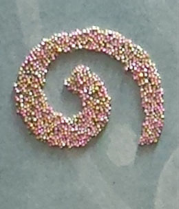
Using a strong adhesive, you can add buttons and beads to your scrapbook titles,Using MicroBeads as an embellishment

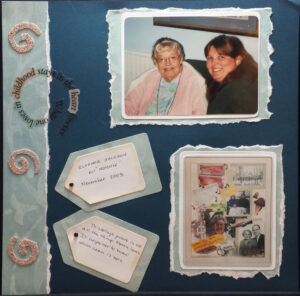
In this layout I used microbeads to make spirals as an embellishment.  First you cut the shape on cardstock, or use a Thin Cut or Cutting machine. Attach a strong adhesive like Liquid Glass, and press the beads into the adhesive. You can do the same things with seed beads and add buttons over the top with a pop-dot.

You can also do bead letters, where the shape doesn’t have to be precise, you can glue directly onto the page, but I prefer to add to cardstock and cut around after they are dry so I am not putting liquid on the page that could cause buckling.

I recommend doing one letter or element at a time. This will give you enough time to get your beads on before the adheasive dries. When the adhesive is dry, tip your embellishment to release all the unglued beads to use another day.


I love using buttons as flowers, and they work well on both cards and scrapbook pages. There are so many fun shapes. Here is a layout using buttons as flowers: